Editor's review
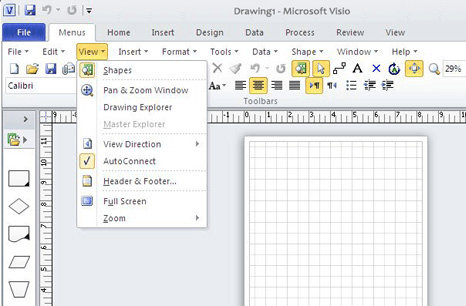
The standard ribbon menu of the Visio 2010 menu is replaced by the classic style menu of the 2003/2007 versions of MS products. This will make users accustomed to the older menu style comfortable with the new product.
Users who were accustomed to Microsoft Visio 2003/2007 may get into a fair amount of confusion. The new ribbon menu puts in a new learning burden on him. When starting to use the new version, getting to know the new functionality, you need to be familiar with the ribbon style many first. So this application introduces the old style menu so that at least the extra burden of learning is removed. You are then able to get into using the Visio straightaway and explore the functionality. Users will be able to switch between the two kind of interfaces. The switch to older version may look like a regressive step. As the interface standard is used in all the other products in other areas of our daily efforts. it might as well be learned. Only way to evaluate if this works is to see if this new menu introduces additional problems. Which fortunately it does not in any significant functionalities.
Classic Menu for Visio 2010 works as adding a new tab "menus" to the Visio 2010 interface. The switching to the old menu or back from it is a easy step. In the old tab the Visio 2007/2003/2002/2000. It is good for international organizations as it supports all the languages of Microsoft Visio 2010 including English, French, German, Italian, Spanish, Portuguese, Japanese, Dutch, Chinese and more. If you have the Visio users in production environment with many operators then the switch to 2010 version could be eased by using this old menu first.


User comments